![]()
BoldMarkup’s logo is a simple circular logo with familiar visual elements;
a capital letter ‘B’ with a single roman architectural column as the stem of the letter, MMXVI and the company name ‘BoldMarkup Ventures’
This identity was developed to reflect an admiration of the heroic stories of the Roman Era, its conquests and its contribution to art.
The Roman Empire was among the most powerful economic, cultural, political and military forces in the world of its time. It was one of the largest empires in world history.
The longevity and vast extent of the empire ensured the lasting influence of Latin and Greek language, culture, religion, inventions, architecture, philosophy, law and forms of government over the empire’s descendants. _Wikipedia
Why those visual elements ?
The capital letter ‘B’ with a single roman architectural column as the stem of the letter which is the center piece of this logo can be interpreted differently, a few examples are ;
B – for Bold
B – for Beauty
B – for Best
and the list could go on but to us at BoldMarkup, the Roman architectural columns which still exists and stand to this day resonates with the mission of the company to serve businesses and grow with them everyday.
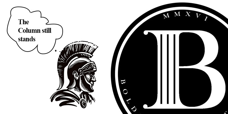
The circular shape was chosen because it represents the notions of totality, wholeness, original perfection, the Self, the infinite, eternity and timelessness.
The color black was chosen because it represents boldness, simplicity and sophistication.
Sponsored Advert

Who we are …
BoldMarkup Ventures is a full-service graphic design firm providing creative services in art direction, conceptualization, design and web development.
What is the story behind your logo?